After nearly 3 years and 7 times the amount of posts, Over Logging finally got a logo

(code && human) || (code && code)
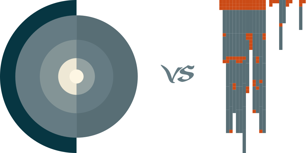
Two designs stayed until the very end – left one, made in Inkskape “by hand”, based on an idea from Hatchful, and a programmatically created one, on the right
Both used Ethan Schoonover’s Solarized color scheme to be easier on the eyes
The right way
There are numerous tools that’ll help you create a logo
Choose a style (e.g. modern, energetic) and industry (tech, sports, arts), enter desired name and optionally a slogan – and pick one of the dozens generated in your behalf
However, no matter how nice they might look, logos should stand for something, and not just be a random representation (oh the irony)

alternative Pac-Man inspired logo
Although the onion-style logo looked ok, it didn’t mean anything
However, writing the blog name with an esoteric programming language and having that code somehow converted to a SVG did
The wrong way
Whitespace programming language has only three valid chars:
- Space
- Tab
- Line feed
Rudimentary as it is, Whitespace still allows stack manipulation sufficient for printing out “Over Logging” in a few lines:
[Space][Space][Space]
[Space][Space][Space][Tab][Space][Tab][Space]
[Space][Space][Space][Tab][Tab][Space][Space][Tab][Tab][Tab]
[Space][Space][Space][Tab][Tab][Space][Tab][Tab][Tab][Space]
[Space][Space][Space][Tab][Tab][Space][Tab][Space][Space][Tab]
[Space][Space][Space][Tab][Tab][Space][Space][Tab][Tab][Tab]
[Space][Space][Space][Tab][Tab][Space][Space][Tab][Tab][Tab]
[Space][Space][Space][Tab][Tab][Space][Tab][Tab][Tab][Tab]
[Space][Space][Space][Tab][Space][Space][Tab][Tab][Space][Space]
[Space][Space][Space][Tab][Space][Space][Space][Space][Space]
[Space][Space][Space][Tab][Tab][Tab][Space][Space][Tab][Space]
[Space][Space][Space][Tab][Tab][Space][Space][Tab][Space][Tab]
[Space][Space][Space][Tab][Tab][Tab][Space][Tab][Tab][Space]
[Space][Space][Space][Tab][Space][Space][Tab][Tab][Tab][Tab]

[Space][Space]
[Space]
[Space]
[Tab][Space][Tab]
[Tab]
[Space][Space]
[Space]


[Space][Space][Tab]
[Space]
real chars are replaced with named fields for clarity
The actual logo was made by a more straightfoward code that used WS script as input to draw spaces and tabs (as squares and rectangles) on a SVG canvas with configurable props (i.e. ratio of \t to [ ])
So to summarize:

src: Imgflip